In 2012, I was enrolled in one of the most enjoyable courses I took in my college career. It was called “History & Principles of Design.” Essentially, it covered the history of graphic design. Each student was assigned to create a poster reflective of one of the great artistic movements in graphic design and advertises a product of that era.
I was limited to pick a product that existed during the Art Nouveau period. Lucky for me, Nintendo was founded as a playing card company in 1889.
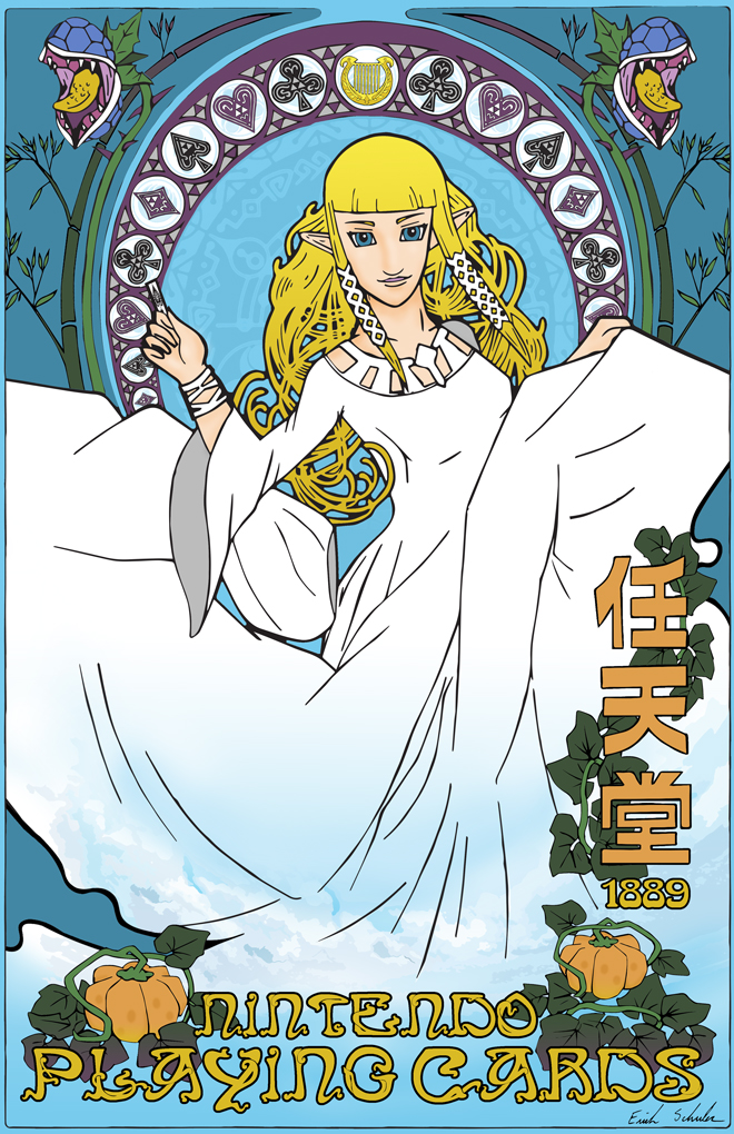
I was assigned Art Nouveau. Naturally, I immediately started brainstorming of ways I could incorporate this project with my passion for video games. The result was “Nintendo Playing Cards.”
Art Nouveau: A Brief Explanation
Art Nouveau, or “New Art,” is a major design movement from the late nineteenth century. It was largely influenced by the European introduction of Japanese woodblock prints and the desire to beautify an urban world shaped by the Industrial Revolution.
Art Nouveau pieces are defined by symbolism and sensuality, focusing much on expressive organic forms. Therefore, nature and floral forms are strongly prevalent. Curved lives and geometric patterns, known as arabesques, are common design elements. Idealized, young women were also a reoccurring subject for Art Nouveau.
Zelda’s fantasy world lends itself naturally to the aesthetic of Art Nouveau.
Even when advertising a product, emphasis was placed on the overall artiness of the piece. This often made it unclear what the poster is about. Eventually this would lead to the rise of Sachplakat, a radically simplistic style.
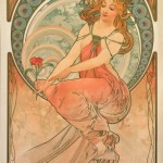
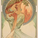
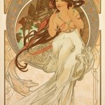

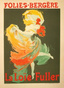
“Nintendo Playing Cards” was greatly influenced by the works of Alphonse Mucha. It also has a little taste of Jules Chéret.
Merging Nintendo’s Zelda with Art Nouveau
I was limited to pick a product that existed during the Art Nouveau period. Lucky for me, Nintendo was founded as a playing card company in 1889. Nintendo originally produced hanafuda (Japanese playing cards), but they did start producing western-styled playing cards in 1902.
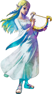 Taking a bit of modern liberty, originally, I was going to do a Super Mario-themed poster. Instead, I decided to go with The Legend of Zelda for the franchise’s access to numerous nature themes which were a common aspect of Art Nouveau. I am pretty fond of Zelda’s character in Skyward Sword, so I made her the predominate female figure, another notable Art Nouveau element.
Focusing on Skyward Sword, various parts of the poster’s design fell into place. There are many references. Can you spot them all? Some of them are more difficult to find than others. Here’s a list:
- Zelda from The Legend of Zelda: Skyward Sword
- Deku Babas
- Bamboo from Bamboo Island
- Pumpkins from Skyloft/Pumpkin Landing
- Gate of Time
- Goddess Harp
- Insignia for Din, Faron, and Lanayru
- Clouds/Sky
- Triforce Motif
- Original Nintendo Logo
- Nintendo’s Vintage Ace of Spades Logo
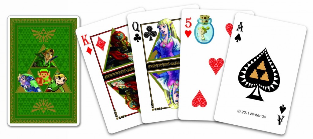
- Card Suits from the Zelda 25th Anniversary Playing Cards
“Nintendo Playing Cards” was hand-drawn, traced with Adobe Illustrator, and colored with Adobe Photoshop.
Reflection
Combining this project with my love for video games made it a challenging, but enjoyable experience. Zelda’s fantasy world lends itself naturally to the aesthetic of Art Nouveau. There were many elements from the Zelda universe that I’ve considered using, but left out in favor of design or creating a unifying theme.
Although art and design is an never-ending process, I am satisfied with what I’ve accomplished. What do you think of it?